Multi-Column Layout
Place two, three, or four fields side by side in a single row. Set column widths by percentage - 50/50, 70/30, 25/25/25/25, or any custom split. Forms look shorter, more professional, and convert better.


What makes it essential for your forms
Why Use Multi-Column Layout?
Shorter, More Compact Forms
Side-by-side fields cut the visible form length in half. Respondents see a shorter form and are more likely to start and finish it.
Custom Column Widths
Set each field to any width percentage - 50/50, 70/30, 25/25/25/25, or any custom split. Full layout control without writing a single line of CSS.
Logical Field Grouping
Place related fields next to each other - first name beside last name, city beside state, start date beside end date. The layout matches how people naturally think about the information.
Mobile-Responsive Automatically
Multi-column rows collapse to a single stacked column on mobile devices. Respondents get side-by-side fields on desktop and a clean vertical flow on phones - no extra work.
No Code Required
No HTML grid classes, no CSS flexbox, no Bootstrap templates. Click a field, set its width percentage, and the form builder handles the layout instantly.
Mix Layouts Freely
Use different column arrangements in different sections of the same form - a two-column row for names, a three-column row for address fields, and full-width rows for text areas.
Get up and running in minutes
How to Use Multi-Column Layout
Add Fields to Your Form
Click a Field and Set Column Width
Adjust Widths for the Layout You Want
Publish - Mobile-Responsive Automatically
What Is a Multi-Column Form Layout?
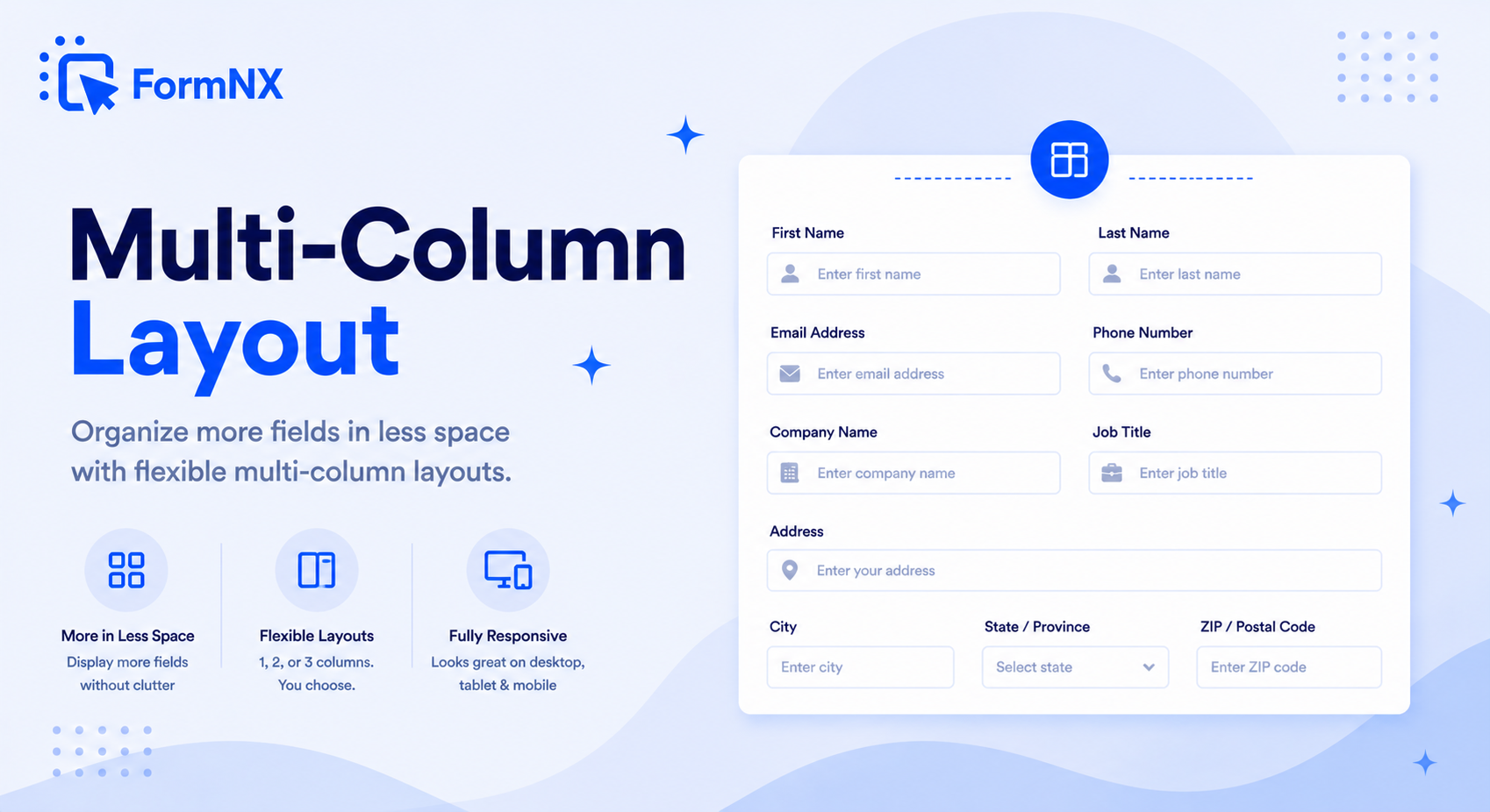
A multi-column form layout arranges two or more fields side by side in a single row instead of stacking every field vertically. For example, first name and last name sit next to each other on one line, city, state, and zip code share a row, or a short dropdown sits beside a wider text input. The result is a form that takes up less vertical space, looks more organized, and feels faster to complete.
Multi-column layouts are standard in paper forms and professional web applications, but many online form builders still force every field onto its own row. FormNX gives you full control over column widths - no HTML, no CSS grid code, no Bootstrap templates to configure.
How to Create Multi-Column Forms in FormNX
Setting up a multi-column layout in FormNX takes a few clicks:
- Add your form fields - drag the fields you need onto the form canvas.
- Select a field - click on any field to reveal the toolbar on the left side of the screen.
- Set the Column Width - find the "Column Width" option and enter a percentage. For example, set it to 50% and the field will take up half the row.
- Set the next field - give the adjacent field a width that fills the remaining space (e.g., another 50% for an even split). The fields automatically line up side by side.
You can use any width combination: 50/50, 70/30, 33/33/34, 25/25/25/25, or any custom split that adds up to 100%. Mix single-column and multi-column rows freely within the same form.
Why Use Multi-Column Form Layouts?
Column layouts do more than make forms look polished. They directly impact how respondents perceive and interact with your form:
- Shorter perceived length - a 20-field form in a single column looks long and intimidating. The same 20 fields arranged in two columns cuts the visible length roughly in half, making respondents more willing to start and finish.
- Logical field grouping - related fields placed side by side make intuitive sense. First name next to last name, city next to state, start date next to end date. This mirrors how people naturally think about the information.
- Higher completion rates - research consistently shows that reducing perceived form length lowers abandonment. Multi-column layouts achieve this without removing any fields.
- Professional appearance - side-by-side layouts look polished and intentional. They signal that the form was designed thoughtfully, which builds trust with respondents.
- Better use of screen space - on desktop monitors, single-column forms leave large empty areas on either side. Multi-column layouts use the available width more efficiently.
Multi-Column Layout Examples
Here are common column arrangements teams use in their forms:
- 50/50 - two equal columns - ideal for name fields (first/last), contact info (email/phone), or date ranges (start/end).
- 70/30 - large and small - perfect for pairing a text input with a short dropdown, or a full address line with a unit/apt number field.
- 33/33/34 - three equal columns - works well for city/state/zip, or grouping three related short inputs like day/month/year.
- 25/25/25/25 - four columns - useful for rating scales, option grids, or compact data entry forms where each field needs minimal width.
- Custom splits - any percentage combination. A 60/40 split, 40/20/40, or whatever your form design requires.
Multi-Column Forms and Mobile Responsiveness
A common concern with multi-column layouts is how they look on phones. FormNX handles this automatically - multi-column rows collapse to a single stacked column on mobile devices. On desktop and tablet, respondents see the side-by-side layout. On phones, fields stack vertically for easy thumb input. No separate mobile version to build or maintain.
FormNX vs Other Multi-Column Form Builders
Some form builders limit you to two columns, others require CSS or HTML knowledge to create side-by-side layouts. Bootstrap-based multi-column form templates require a developer to customize. Google Forms does not support multi-column layouts at all.
FormNX supports up to four columns per row with fully custom width percentages - all configured visually with zero code. You can mix different column counts in different sections of the same form, and the layout is responsive on all devices out of the box. Available on every plan, including free.
Common use cases where Multi-Column Layout excels
What You Can Build with Multi-Column Layout
Don't just take our word for it
Hear from our customers
"I've been looking for an alternative to Jotform - one that would accept payments directly from the form. The learning curve is short, supported by great customer service which never let me down."

"There are super features in this form creator. They REALLY took a lot of time to create a fantastic program. I was using another form creator but switching a lot of my forms to this application. The tech support is amazing."

"Easy to build forms from scratch with a long list of fields. Don't want to start from scratch? No problem — many templates available. Every integration I can think of is available. Customer support is quick and very helpful."

Multi-Column Layout: Frequently Asked Questions
-
What is a multi-column form layout?
A multi-column form layout arranges two or more fields side by side in a single row instead of stacking them vertically. For example, first name and last name appear next to each other on the same line. This makes forms shorter, more organized, and more professional-looking - and it improves completion rates by reducing perceived form length.
-
How many columns can I have in a FormNX form?
FormNX supports up to four columns in a single row. You can set each field to any width percentage - 50/50 for two equal columns, 33/33/34 for three columns, 25/25/25/25 for four columns, or any custom split like 70/30 or 60/20/20. The widths just need to add up to 100%.
-
How do I create a multi-column form without coding?
In FormNX, click on any form field to select it, then find the "Column Width" option in the toolbar. Set the width percentage - for example, 50% for the first field and 50% for the next. The fields automatically line up side by side. No HTML, CSS, or Bootstrap knowledge needed.
-
Are multi-column forms mobile-responsive?
Yes. Multi-column layouts in FormNX automatically collapse to a single stacked column on mobile devices. On desktop and tablet, respondents see the side-by-side layout. On phones, fields stack vertically for easy input. This happens automatically - no separate mobile version to configure.
-
Can I mix single-column and multi-column rows in the same form?
Yes. You can use different column layouts in different sections of the same form. For example, a two-column row for first name and last name, a three-column row for city, state, and zip code, and a full-width row for a message text area - all in one form.
-
Can I use multi-column layouts with multi-step forms?
Yes. Multi-column layouts work with every FormNX feature, including multi-step forms, conditional logic, and all field types. You can have multi-column rows on any step of a multi-page form.
-
Do multi-column forms work on WordPress?
Yes. Forms built with FormNX can be embedded on any WordPress site via Gutenberg block, Classic Editor shortcode, or Elementor widget. The multi-column layout renders exactly the same whether the form is on WordPress, Webflow, Shopify, or shared via a direct link.
-
Does Google Forms support multi-column layouts?
No, Google Forms does not natively support multi-column layouts - every field is displayed in a single column. FormNX gives you full multi-column control with custom width percentages, and you can send responses to Google Sheets if you need the Google ecosystem integration.
Ready to Use Multi-Column Layout?
Start building professional forms with this powerful feature today
Get Started Free NowOther features that work great with Multi-Column Layout
More Related Features
Ready-Made Templates
Skip the blank page. Pick from 1,000+ templates for surveys, registrations, orders, feedback, and more - then customize...
See How It WorksDrag & Drop Form Builder
Build any web form by dragging fields onto a visual canvas. No HTML, no code - just pick a field, drop it in place, set...
See How It WorksPowerful Form Fields
25+ field types - from text inputs and dropdowns to signature capture, matrix tables, star ratings, and voice recording....
See How It Works