🖱️ Submit Button Design
What is Form Submit Button Settings?
The "Form Submit Button Settings" in FormNX enable you to personalize/change the appearance and behavior of the submit button on your forms.
By customizing the submit button, you can create a visually appealing and user-friendly form that aligns with your brand and design preferences.
Submit Button Settings
To personalize submit button for a form in FormNX, follow these steps:

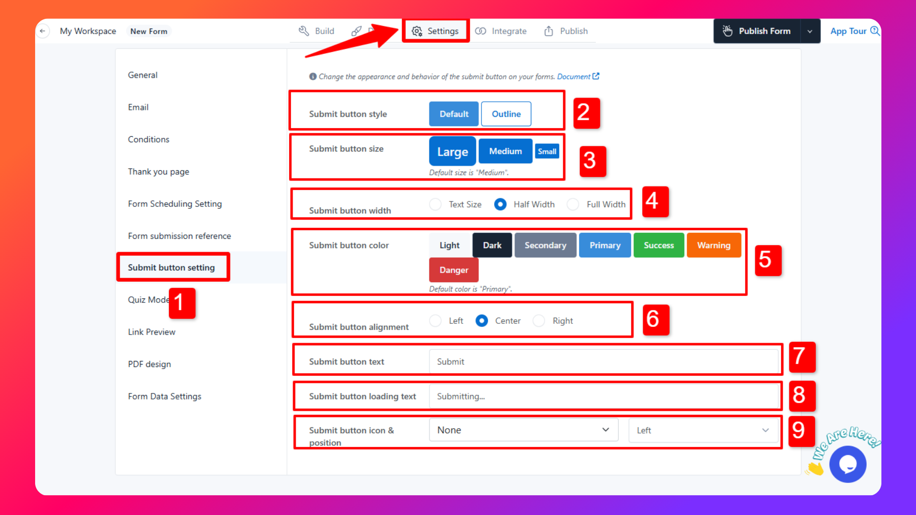
Access Settings: To personalize the submit button, click on "Settings" tab & then click on "Submit button setting" section.
Submit Button Style: Choose between "Filled" or "Outline" for the submit button's visual style.
Submit Button Size: Select the desired size for the submit button, such as "Large," "Medium," or "Small."
Submit Button Width: You can customize the Submit button width according to your requirements. You have three different button width options, i.e.,.
Text Size:
- Enable the text size option for the submit button to automatically adjust the width based on text content.
- Specify the alignment of the submit button, which can be "Left," "Right," or "Center."
- If you enable the Draft Button, then both the Draft and Submit buttons occupy a width equal to the text size, and alignment applies to both.
Half Width:
- If you enable the half-width option for the submit button it covers 50% of the width of the form.
- Specify the alignment of the submit button, which can be "Left," "Right," or "Center."
- If you enable the Draft Button, then both Draft and Submit buttons occupy 50% width each in the form, and alignment options will not work in this case.
Full Width:
- Choosing the full-width size option for the submit button in a form makes it occupy 100% width, and alignment options will not work in this case.
- If you enable the Draft Button, then both the Draft and Submit buttons share the form width equally (50% each).
Submit Button Color: Pick a color that matches your form's design theme.
Submit Button Alignment: Specify the alignment of the submit button, which can be "Left," "Right," or "Center."
Submit Button Text: Enter the text you want to display on the submit button. This text typically reads "Submit," but you can customize it to match your form's purpose.
Submit Button Loading Text: If you want to display a different text while the form is being submitted, enter it here. This is useful to provide user feedback during the submission process.
Submit Button Icon & Position: Optionally, you can choose an icon for the submit button and specify its position (left or right of the button text).
Save Your Settings: Be sure to save your form.
Once configured, your form's submit button will reflect the selected style, size, color, alignment, and text. If you provided a loading text, it will be displayed during form submission.
Example Use Cases
Professional Contact Form
For a professional contact form on your business website, you can use the submit button settings to create a sleek and elegant button with your brand's color and logo. Ensure the button text is "Submit Inquiry" to encourage users to reach out.
Explore Contact Form Templates
Registration Form
If you have a registration form for an event, use the submit button settings to align the button to the right, make it large and eye-catching, and add an icon representing an event calendar. You can set the button text as "Register Now."
Explore Registration Forms Templates
Feedback Survey
When collecting feedback through a survey, maintain a clean and straightforward design by using an outlined button with a subtle color. Add a "Send Feedback" text to the button to make its purpose clear.
Explore Feedback Form Templates