🎨 Designing a Beautiful Form to Match Your Brand
Designing a form involves changing its visual elements, such as colors, background, logo, label styles, required field indicators, error messages, and more.
By customizing these design aspects, you can create a beautiful personalised form that reflects your brand's aesthetics and personality.
Steps to customizing Form Design
To design a form in FormNX, follow these steps:
- Log in to your FormNX account and open the form you want to design or create a new one.
- Navigate to Design Settings: In the form builder, look for the "Design" tab, located beside the "Build" tab in the top.
- Customize Design Elements: Inside the "Design" tab, you'll find options to change the design of your form.

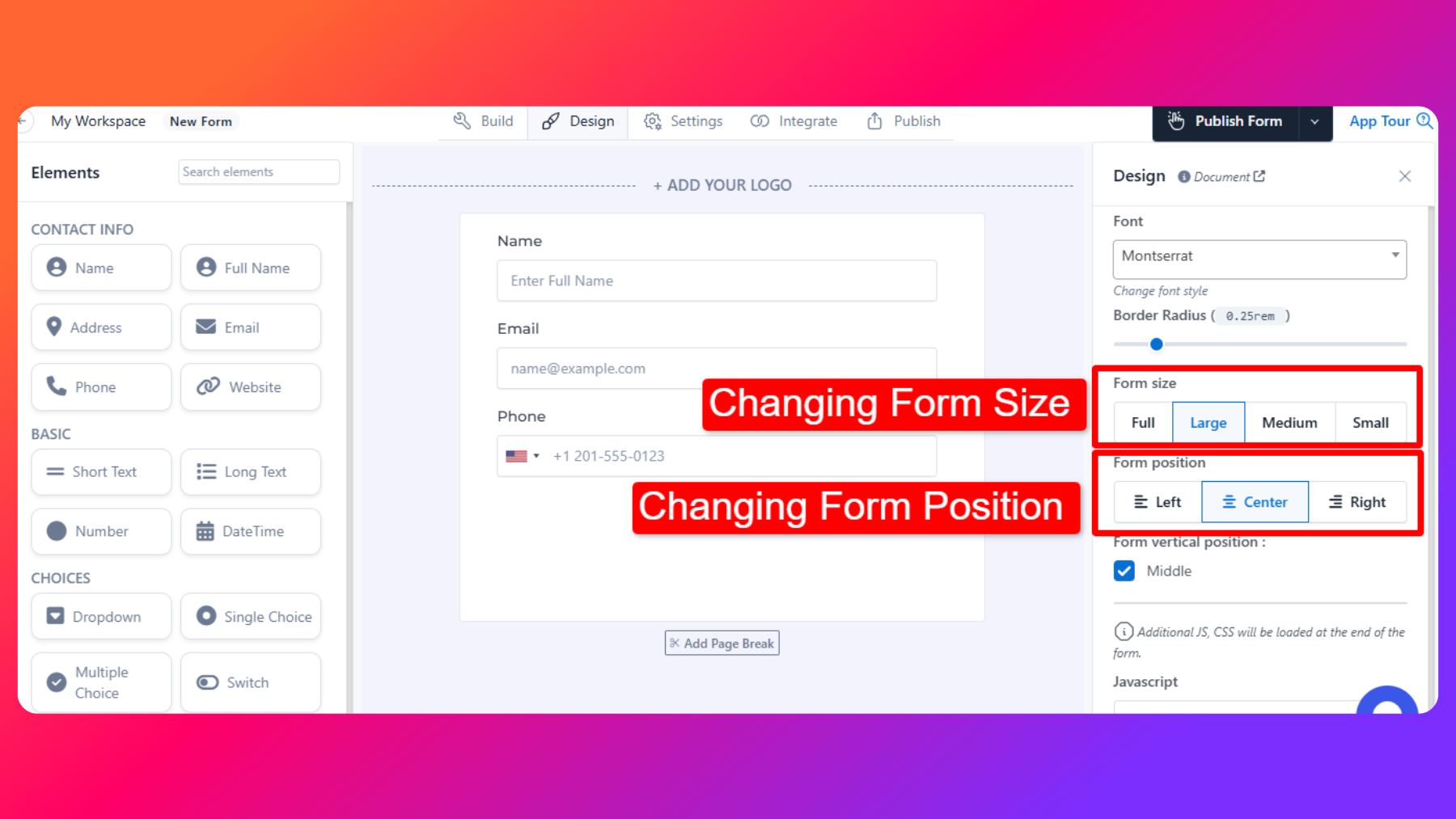
Changing Form-Size
Choose the size of the form, such as Full, Large, Medium, or Small, based on your preferences and the layout of your web page.
Changing Form-Position
Align the form to the left, center, or right of the page to ensure it integrates smoothly with your website's design.

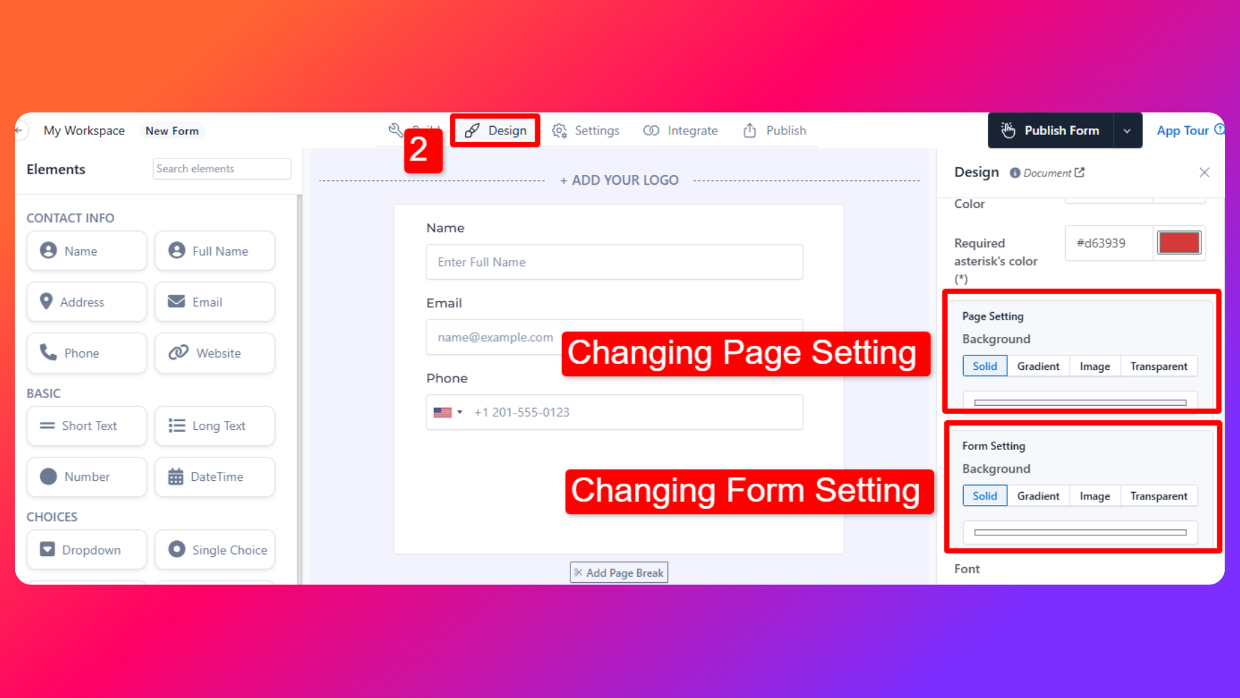
Page Setting
Modify the page design by selecting from options like a solid color background, gradient, image, or transparency. This allows you to create visually appealing backgrounds that complement your brand.
Form Page Setting
Similar to page settings, you can adjust the form's design by choosing a background style that matches your brand's aesthetics.
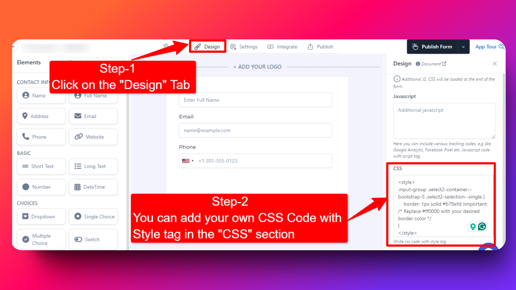
How to Add Custom CSS in your Forms
To add custom CSS, refer to the screenshot below.

Custom CSS for Changing the color of Submit Button
Note: Replace this #ff5733 with HEX of color you want to set.
.btn.submit_btn {
    background-color: #ff5733; /* Change this color to your desired color */
    border-color: #ff5733; /* Change this color to match the background */
}

.btn.submit_btn:hover {
    background-color: #cc4626; /* Change this color for the hover state */
    border-color: #cc4626; /* Change this color to match the background */
}
Custom CSS for Changing the color of Progress Bar
.progress-bar {
    background-color: #00a816; /* replace #00a816 with HEX of color you want to set */
}
Custom CSS for Changing the color of Previous Button
#prev_btn {
    background-color: #00a816;
    border: #008000;
    color: #ffffff;
}
Custom CSS for Changing the color of Next Button
#next_btn {
    background-color: #00a816;
    border:  #00a816;
}
Custom CSS for Changing the color of the Icon's
.fa-solid {
    color: #00a816; /* Change this color to your desired color */
}
Custom CSS for changing the color of the Border of the Input form fields
.input-group .form-control,
        .input-group .input-group-text {
            border: 2px solid #ff003a; /* Change this color to your desired border color */
        }

.input-group .form-control:focus {
    border-color: #ff003a; /* Ensure the same color is shown when the input field is focused */
    box-shadow: 0 0 0 0.25rem rgba(48, 213, 105, 0.25); /* Add a shadow effect on focus */
    outline: none; /* Remove the default outline on focus */
}
Custom CSS for changing the color of the Border of the Dropdown form fields
<style>

/* Change the border color of the select2 container */
.input-group .select2-container--bootstrap-5 .select2-selection--single {
    border: 1px solid #b78efd !important; /* Replace #b78efd with your desired border color */
}

/* Change the border color on focus */
.input-group .select2-container--bootstrap-5.select2-container--focus .select2-selection--single {
    border-color: #b78efd !important; /* Replace #b78efd with your desired border color */
box-shadow: 0 0 0 0.25rem rgba(48, 213, 105, 0.25); /* Add a shadow effect on focus */
    outline: none; /* Remove the default outline on focus */
}


.select2-search__field:focus {
    border-color: #b78efd !important; /* Replace #b78efd with your desired border color */
    box-shadow: 0 0 0 0.25rem rgba(48, 213, 105, 0.25) !important; /* Add a shadow effect on focus */
    outline: none; /* Remove the default outline on focus */
}

</style>
Custom CSS for changing the color of the text beside Scale Rating element
<style>

.scale-rating-container span {
    color: red; /* Change this to whatever color you prefer */
}

</style>
Custom CSS to hide the label of the Fields and the Asterisk symbol
<style>
label.form-label {
    display: none;
}
</style>
Custom CSS for changing the color of the buttons/checkboxes of single-choice or multiple-choice elements
<style>
.form-check-input:checked {
    background-color: #28a745; /* Custom color when selected */
    border: 2px solid #28a745; /* Change the border color when checked */
    box-shadow: 0 0 5px rgba(40, 167, 69, 0.5); /* Add a subtle shadow */
}
</style>
Custom CSS to set the background of the form to 50% transparency with a background color for the fields
NOTE: You can change the rgba color and transparency % based on your specific requirements.
<style>
/* Make the card background 50% transparent */
.cardouter {
    background-color: rgba(255, 182, 193, 0.5) !important; /* 50% transparent with light pink color*/
    border: none; /* Optional: Remove border if it conflicts with transparency */
    box-shadow: none; /* Optional: Remove shadow to keep the transparency clean */
}
</style>
Custom CSS for changing the text of the Next Button
<style>
#next_btn {
    font-size: 0; /* Hide the original text without affecting the icon */
    position: relative;
}

#next_btn::before {
    content: "Continue"; /* Your desired text */
    font-size: 16px; /* Set font size for the new text */
    color: inherit; /* Use the button's original text color */
}

#next_btn i {
    font-size: 16px; /* Keep the icon visible */
    margin-left: 8px; /* Add space between text and icon */
    position: relative;
}
</style>
Custom CSS for changing the text of the Previous Button
<Style>
#prev_btn {
    font-size: 0; /* Hide the original text without affecting the icon */
    position: relative;
}

#prev_btn::after {
    content: "Go Back"; /* Your desired text */
    font-size: 16px; /* Set font size for the new text */
    color: inherit; /* Use the button's original text color */
}

#prev_btn i {
    font-size: 16px; /* Keep the icon visible */
    margin-right: 8px; /* Add space between icon and text */
    position: relative;
}
</style>
Custom CSS for changing the text of the Draft Button
<style>
.draft_btn {
    font-size: 0; /* Hide the original text */
    position: relative;
}

.draft_btn::before {
    content: "Custom Text"; /* Replace with your desired text */
    font-size: 16px; /* Set font size for the new text */
    color: inherit; /* Use the button's original text color */
}
</style>
Custom CSS to hide the Previous Button
<style>
#prev_btn {
    display: none;
}
</style>
Custom CSS for adjusting the font size of the Lowest and Highest rating labels in the Scale Rating element.
<style>
.scale-rating-lowest-text.fw-semibold,
.scale-rating-highest-text.fw-semibold {
    font-size: 18px; /* Adjust the font size as desired */
    font-weight: normal !important; /* Overrides the default boldness */
}
</style>
Custom CSS to customize the Border color, Text color, Background color, On Hover color, and Selected color of the Scale Rating buttons.
<style>
/* Change the button border and background color */
.scale-rating-container .btn-outline-primary {
    border-color: #4CAF50; /* Set your desired border color */
    color: #4CAF50; /* Set the text color of the button */
    background-color: #FFFFFF; /* Set the background color of the button */
    transition: all 0.3s ease; /* Add a smooth transition for hover effects */
}

/* Change the button color on hover */
.scale-rating-container .btn-outline-primary:hover {
    background-color: #4CAF50; /* Set the background color on hover */
    color: #FFFFFF; /* Set the text color on hover */
}

/* Change the button color when selected */
.scale-rating-container .btn-check:checked + .btn-outline-primary {
    background-color: #4CAF50; /* Set the selected background color */
    color: #FFFFFF; /* Set the text color when selected */
    border-color: #4CAF50; /* Keep the border color consistent */
}

</style>
Custom CSS for changing the color of the by default help text of the Upload elements (such as File Upload, Image Upload)
<style>
.form-text span {
    color: #ffffff; /* Change this to your desired color */
}
</style>
FAQs
Can I change the colors of specific form elements?
Yes, you can customize the colors of specific form elements, such as labels, required field indicators, and error messages, to match your brand's color scheme.
Is it possible to upload my company logo to the form?
Yes, Absolutely! You can easily add your company logo to the form to reinforce your brand identity.
Are there options for custom CSS styling?
Yes, if your plan has option for 'Custom JS/CSS' you can add custom css.
To add custom CSS, refer to the screenshot below.
