📅 Datetime Picker
The Datetime Picker element in FormNX lets you collect date and time values from users in a simple, interactive way. Instead of asking users to type dates manually, they can pick a date (and optionally time) from a clean calendar interface — which prevents typos and ensures consistent formatting.
This element is ideal for booking forms, appointment scheduling, event registration, age verification, and any form that needs date or time input.
📌 How to Add the Datetime Picker to Your Form
Follow these simple steps:
- Open the Form Builder.
- On the left hand side, you'll see the Elements section.
- Find the Datetime element.
- Drag and drop the element onto your form OR click on the element to add it automatically.
Once added, the Datetime Picker will appear in your form layout, ready to be customized.
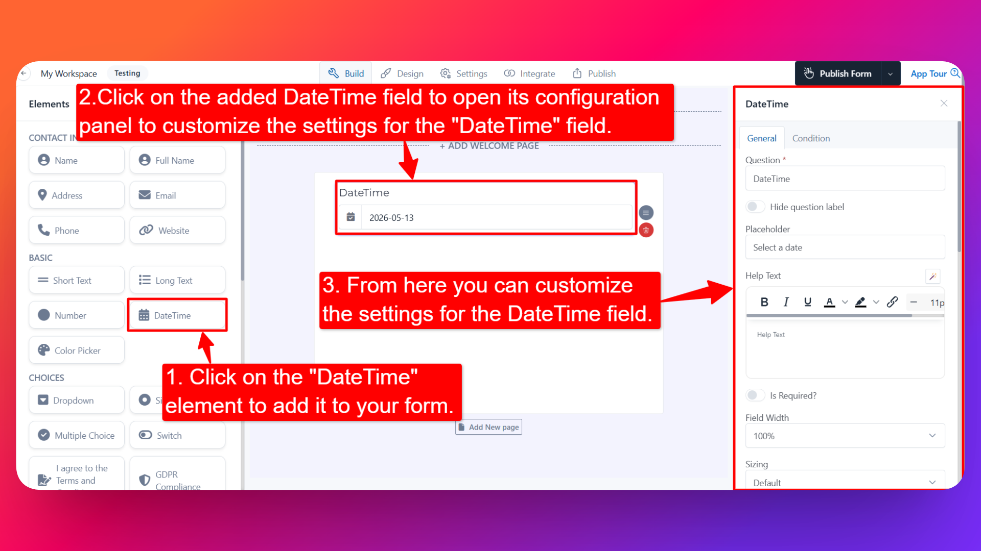
⚙️ How to Configure the Datetime Picker
To customize the field:
- Click on the Datetime Picker element in your form.
- The configuration panel will open on the right hand side.
You can configure the following options:
- Question Label ✏️
- Add the question or label that users will see for this field.
- Example:
- "Select your appointment date"
- "Choose your date of birth"
- Help Text 📝
- Add a short instruction or hint below the field to guide users.
- Example: "Please select a date within the next 30 days."
- Hide Question Label 🙈
- Enable this option to hide the question label while keeping the date picker visible.
- Placeholder 💬
- Add a placeholder value that appears inside the field before the user selects a date.
- Example: "Select a date" or "DD/MM/YYYY".
- Is Required ✅
- Enable the Is Required option to make the field mandatory.
- Users won't be able to submit the form unless they select a date.
- Prefix & Suffix Icons 🎨
- Add an icon at the beginning (prefix) or end (suffix) of the field.
- Example: A 📅 prefix icon to clearly indicate it's a date field.
- Start Date 📆
- Set the earliest date users can select from the calendar.
- Useful for restricting selections to future dates only (e.g., for booking forms).
- End Date 📆
- Set the latest date users can select from the calendar.
- Useful for limiting selections to a specific time window (e.g., event dates).
- Days From today ⏳
- Set the earliest selectable date as a number of days from the day the form is opened, instead of a fixed calendar date.
- Because it is relative, it keeps working as time passes — you don't have to keep editing the form.
- Example: enter
2so the first date a respondent can choose is two days from today, giving you a guaranteed two days of lead time on every booking.
- Date Format 🗓️
- Choose how the date will be displayed in the field and stored in submissions.
- Common formats include
DD/MM/YYYY,MM/DD/YYYY,YYYY-MM-DD, and more.
- Default Value 🎯
- Pre-fill the field with a default date.
- Useful when most users would select the same date, or when suggesting a starting point.
- Disable Days 🚫
- Block specific days of the week from being selectable — for example Sunday, or every weekend.
- Example: Disable Saturdays and Sundays for business-only appointments.
Disable Days works on days of the week, not on individual calendar dates. There is no option to block one specific date (such as a single public holiday or a fully booked day). To restrict the selectable window itself, use Start Date, End Date or Days From today.
- Enable Time Picker ⏰
- Turn on this option to allow users to select a time along with the date.
- Useful for appointment booking, event scheduling, and any form that needs precise timing.
With the Time Picker enabled you can also set:
- 12 / 24 Hour Format 🕐 — choose whether the time is shown as a 12-hour clock with AM/PM (
02:30 PM) or a 24-hour clock (14:30). Pick 24-hour if your respondents are outside the US or you want to avoid AM/PM mistakes. - Start Time & End Time ⏳ — set the earliest and latest time that can be selected, so respondents can only choose within your operating hours. Example: set Start Time to
09:00and End Time to17:00to keep bookings inside a 9-to-5 working day.
- Sensitive Data 🛡️
- Mark the field as Sensitive Data to handle the response with extra care (such as masking it in submissions).
- Useful when collecting dates like date of birth or other personal details.
- Age Verification 🔞
- Use the Datetime Picker to verify that users meet a minimum age requirement before submitting the form.
- Perfect for forms that should only accept submissions from users above a specific age (e.g., 18+).
- For complete setup instructions, see the dedicated guide: Age Verification in Forms.
👤 How It Works for Users
When users open the form:
- They'll see the Datetime Picker with the label and any help text you've configured.
- Clicking on the field opens a clean calendar interface.
- They can:
- Pick a date from the calendar (within the allowed start/end date range, or on/after your Days From today offset)
- Pick a time (if Time Picker is enabled), shown on a 12- or 24-hour clock and limited to your Start/End Time range
- Disabled days of the week will appear as non-selectable.
- After selecting their date/time, they can continue filling and submitting the form.
💡 Common Use Cases
- Appointment booking — Let users choose a date and time for meetings or consultations.
- Event registration — Collect attendance dates for events, workshops, or webinars.
- Date of birth — Capture DOB for personalization or age verification.
- Hotel & travel bookings — Pick check-in/check-out dates.
- Deadline & due dates — Let users set deadlines for tasks, deliveries, or applications.
- Age-restricted forms — Combine with Age Verification to prevent underage submissions.
The Datetime Picker makes it easy to collect accurate dates and times from your users — no manual typing, no formatting errors, and no extra coding needed.